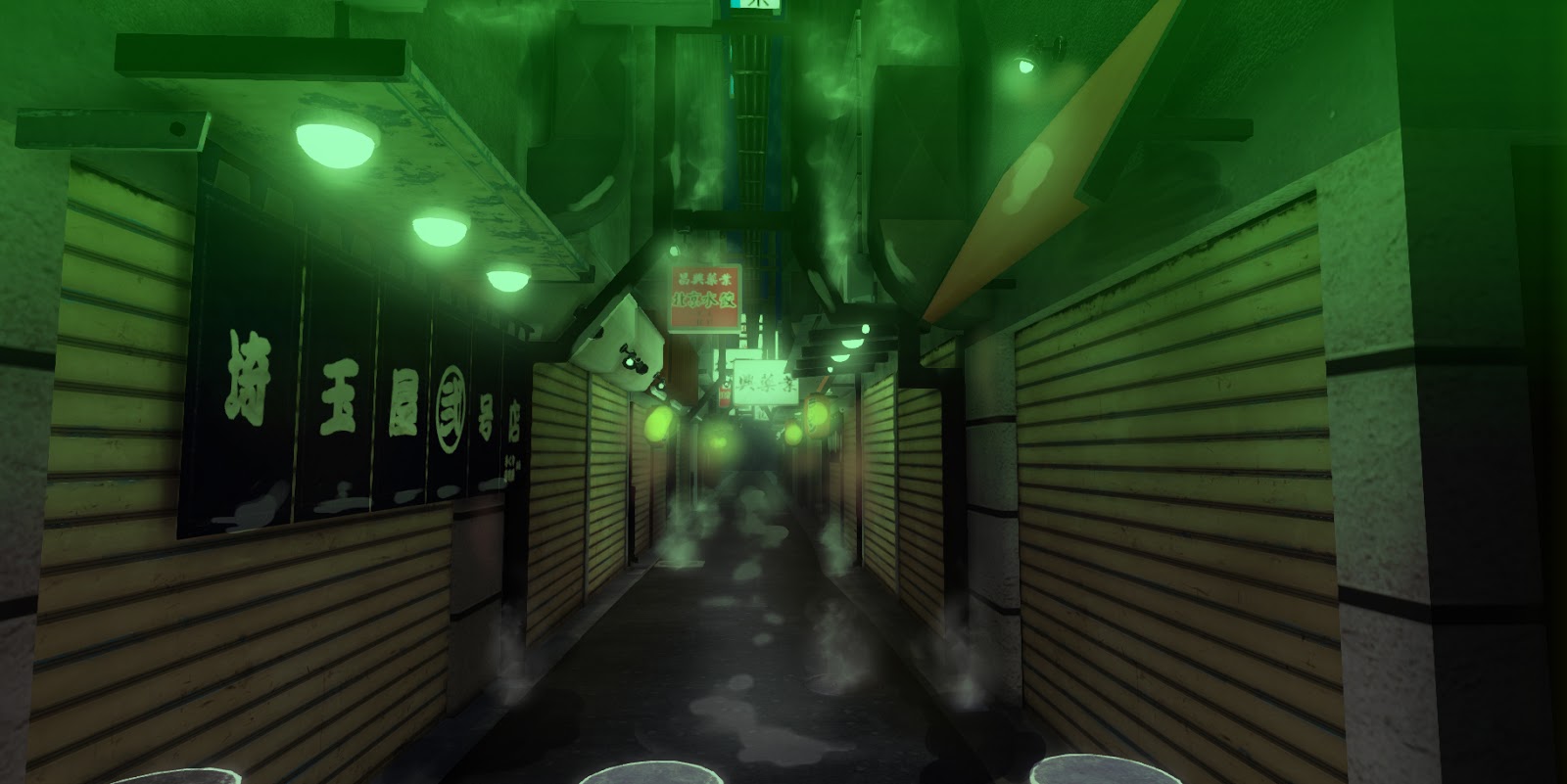
So I took the screenshot and did some paintovers to get a better sense atmosphere and mood. It's only a quick thing but it helps me to know where to take it. But I was still having some trouble with the lighting and colour palette.

I went back to my reference to find good images of mood and lighting to help inform my decisions on lighting. As you can see below I've been just using some overlays to get a quick sense of how it will look.


Below is an screenshot taken from Bioshock because I really liked the colour palette and mood. Even though it's not accurate to the reference I've collected I think it's a much nicer tone for my level.


I think the lighting and tone in these last two is much nicer than the ones that try to adhere to the reference. I've found this very useful to help understand where I need to take my level now. Hopefully it can get me on the right path now.
No comments:
Post a Comment